Process
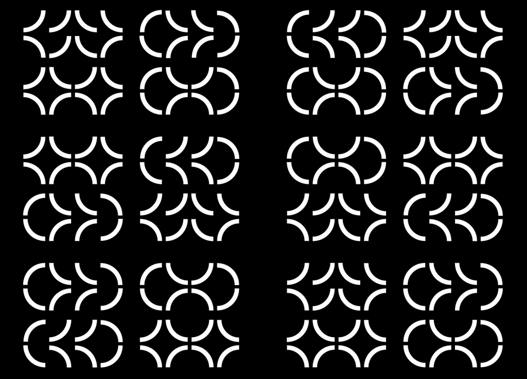
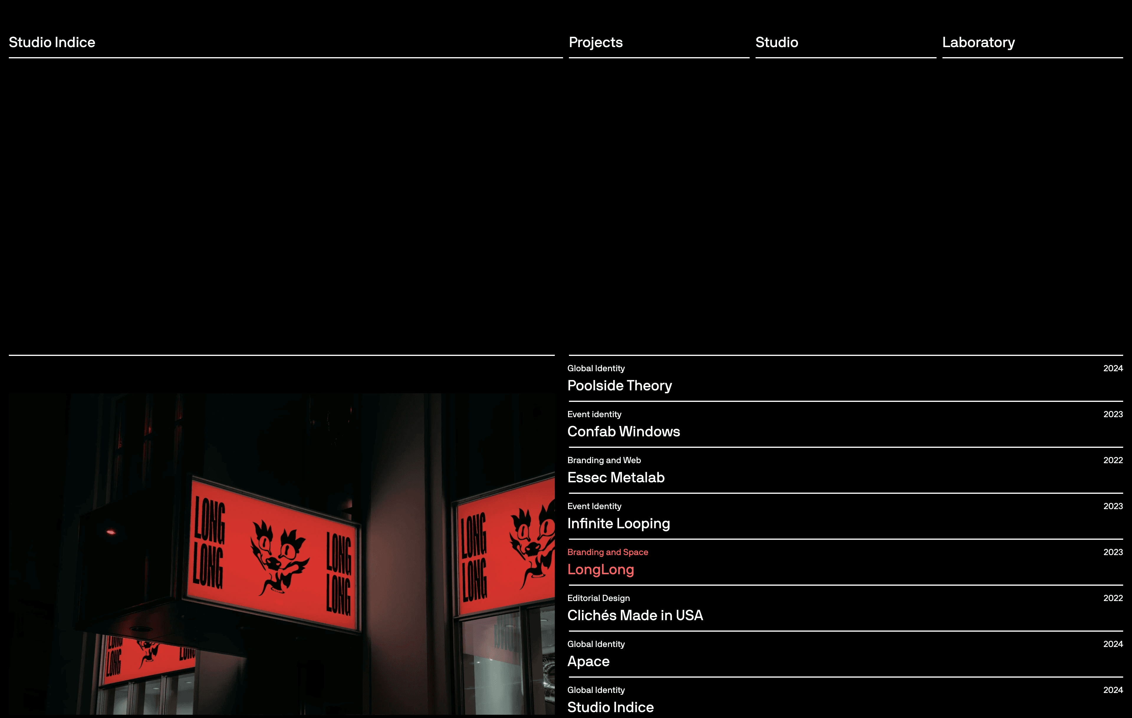
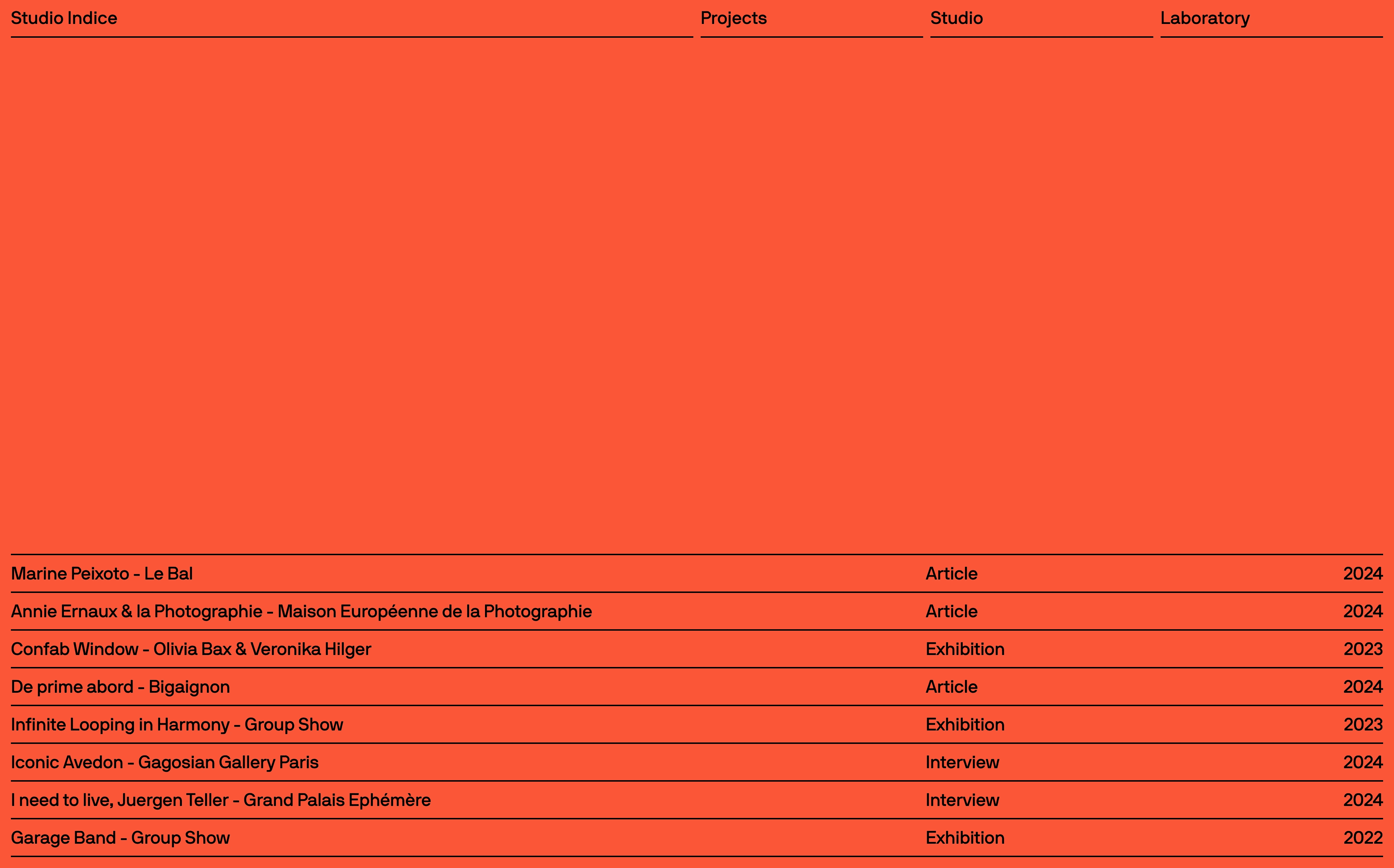
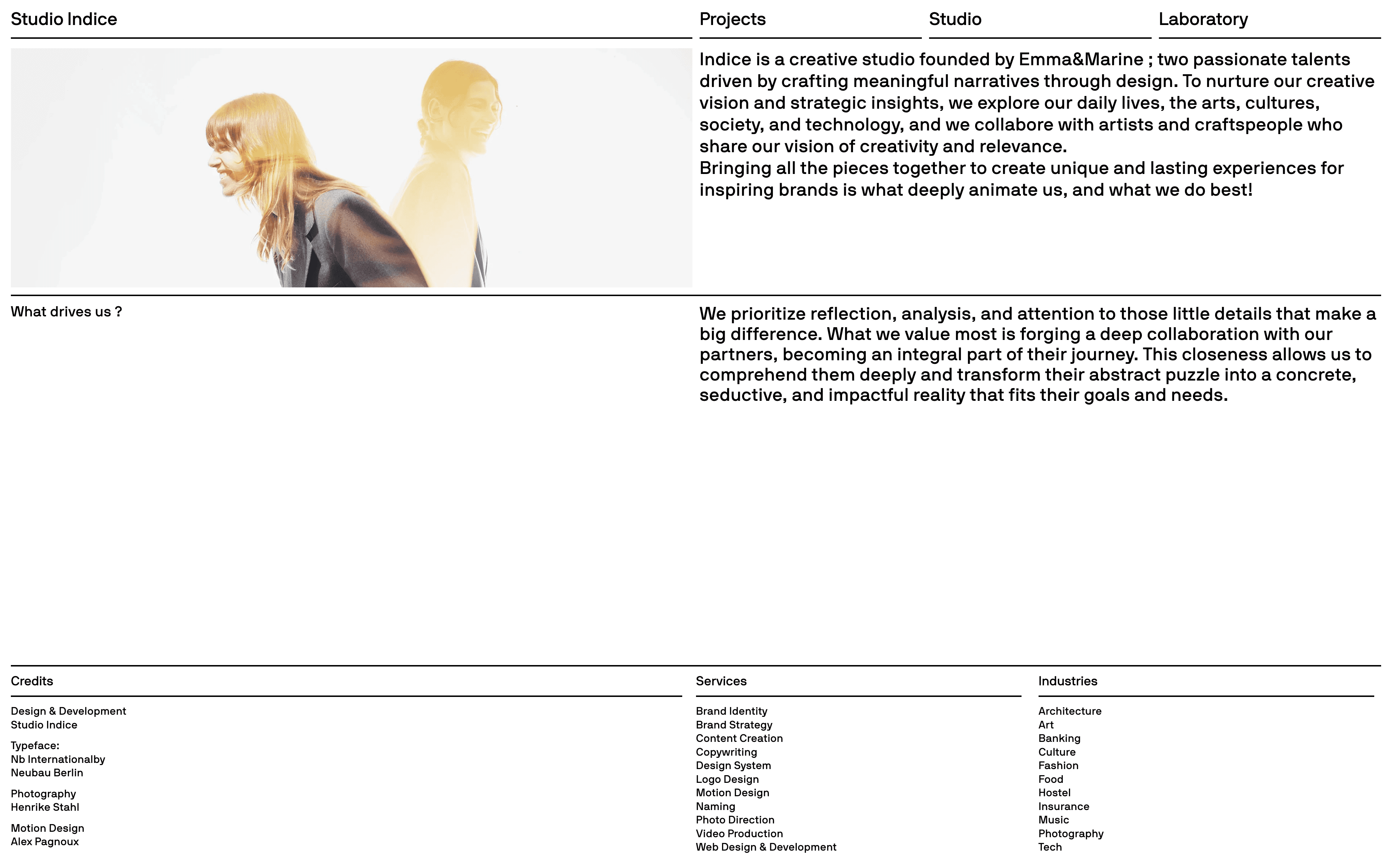
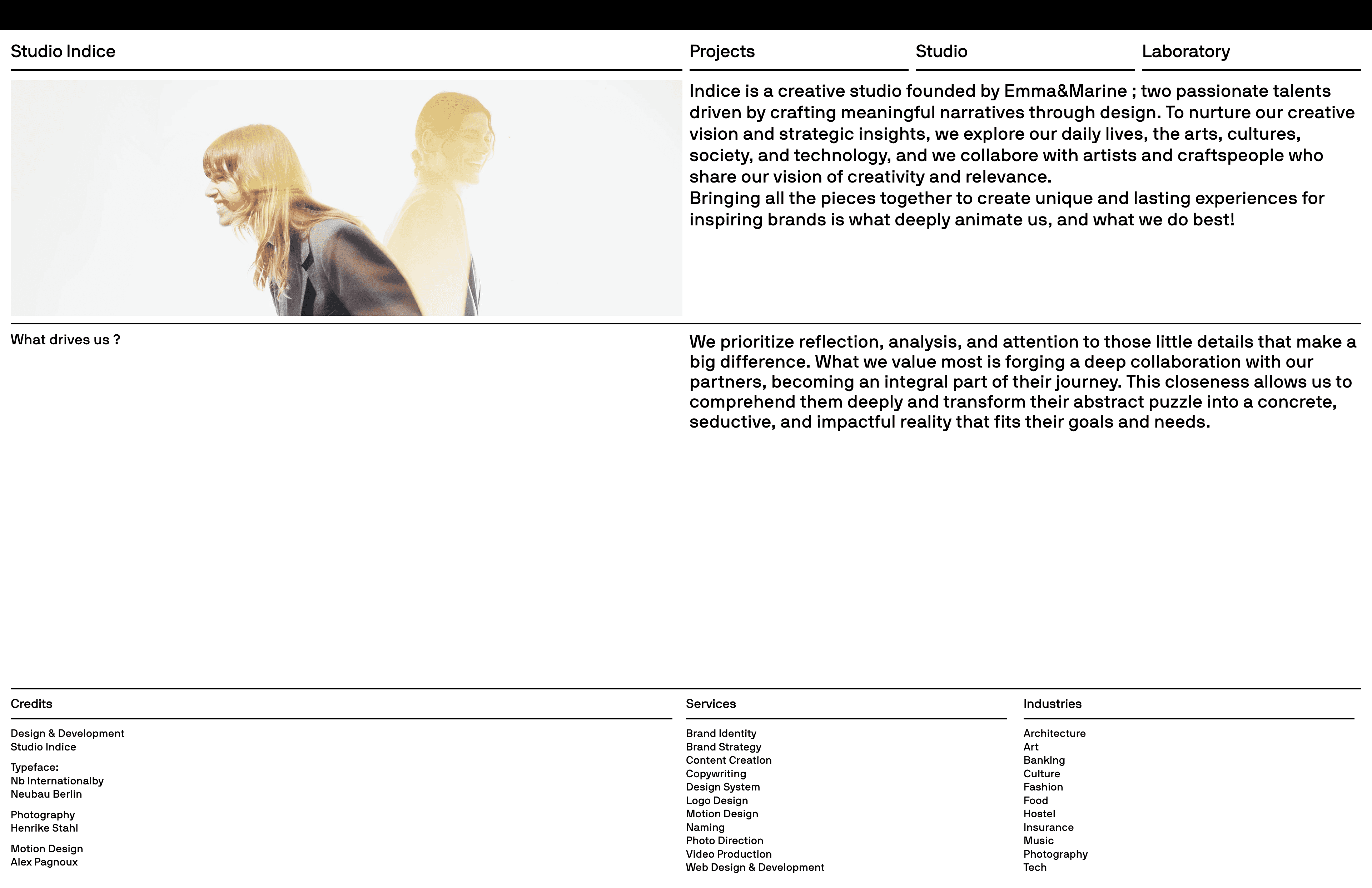
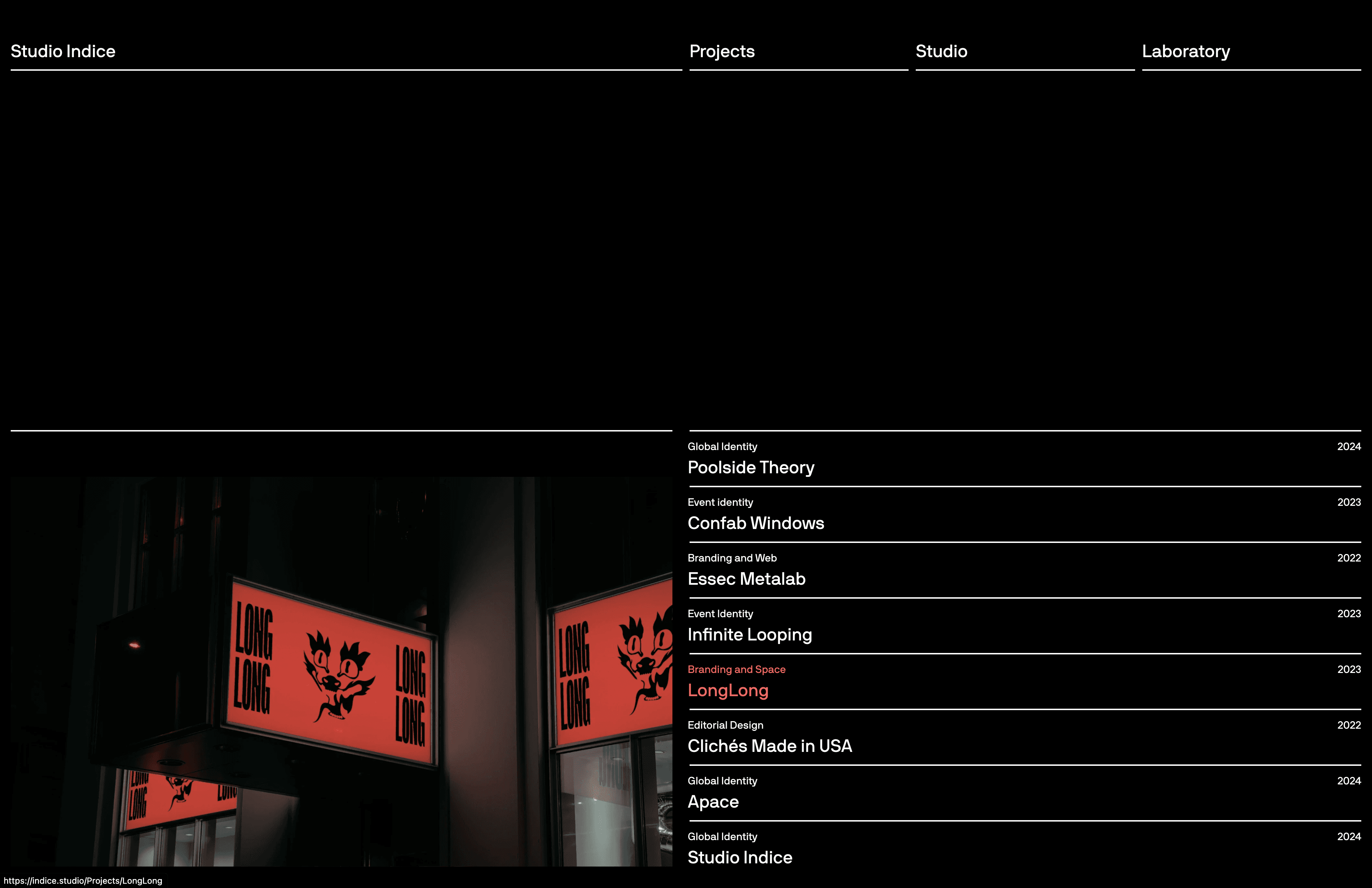
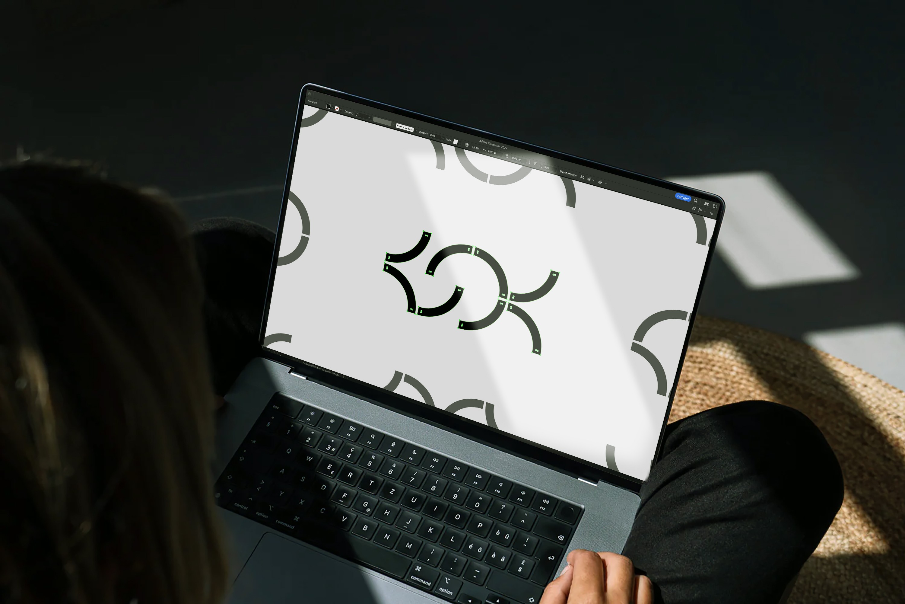
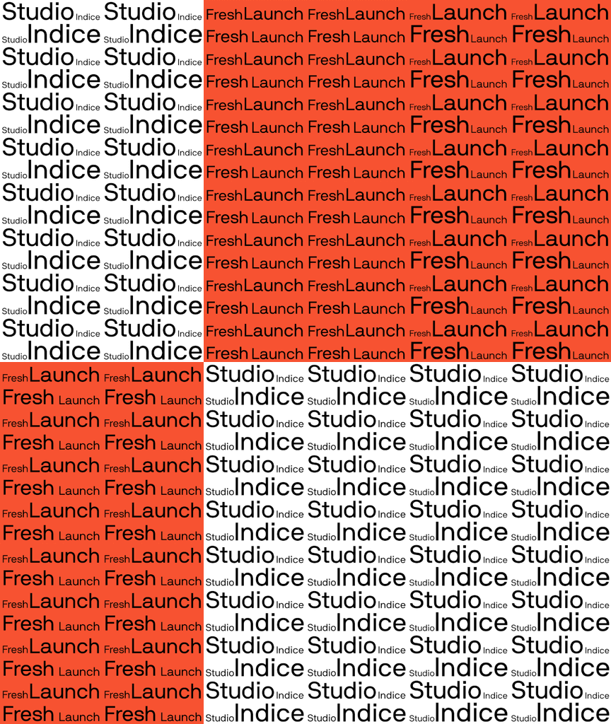
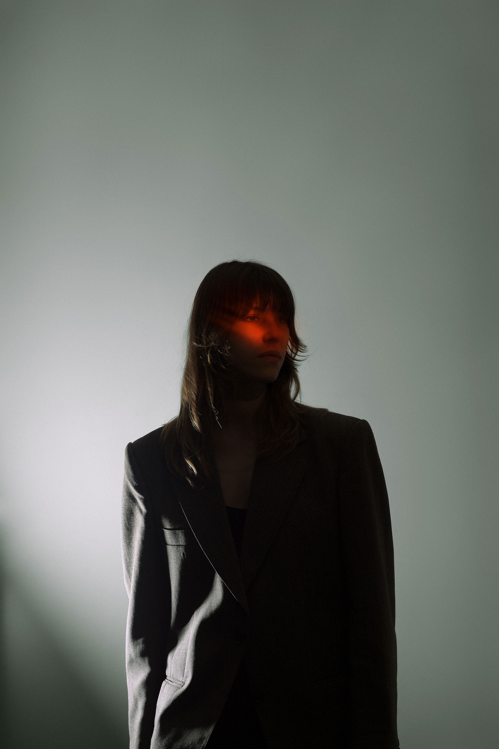
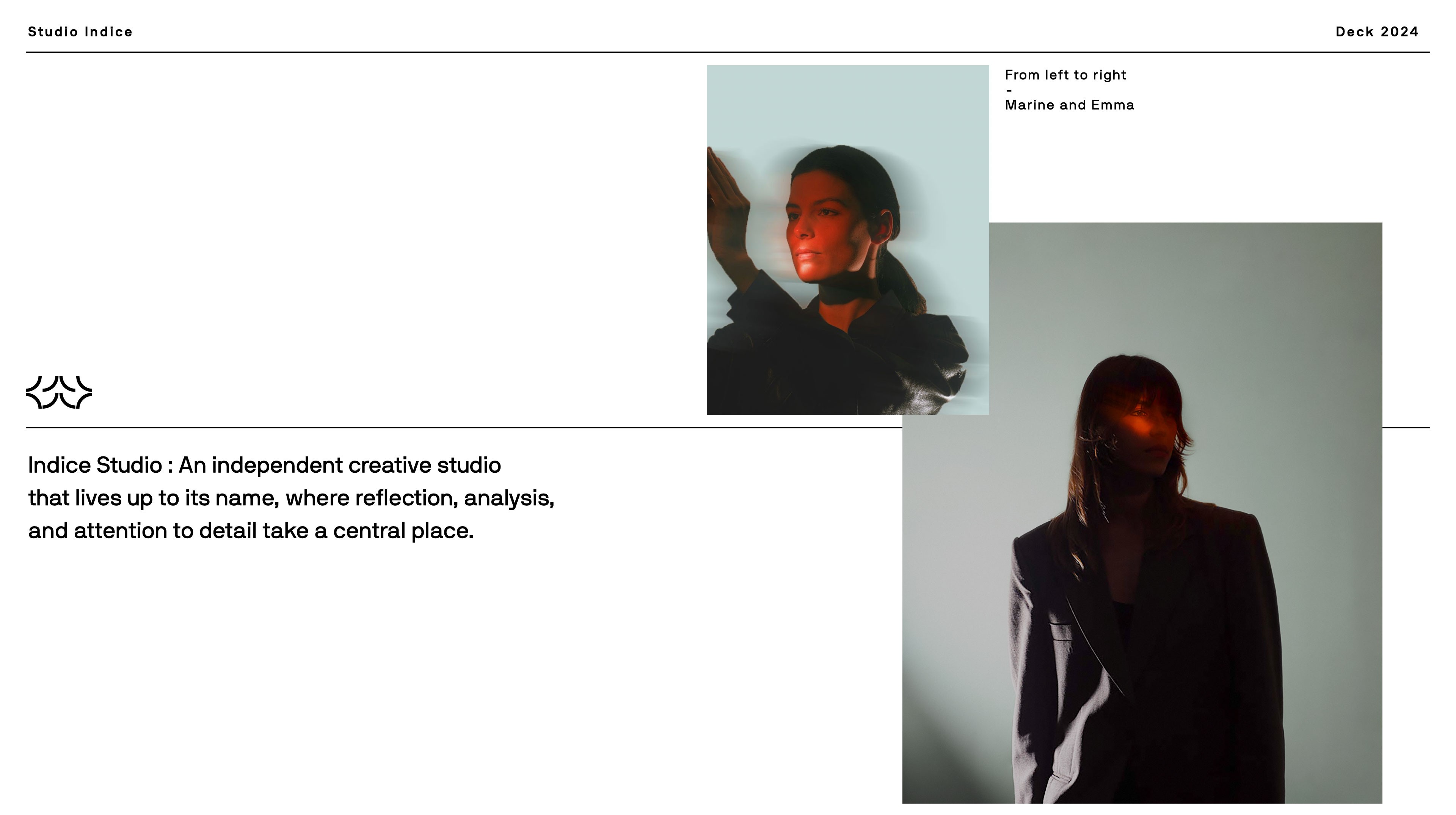
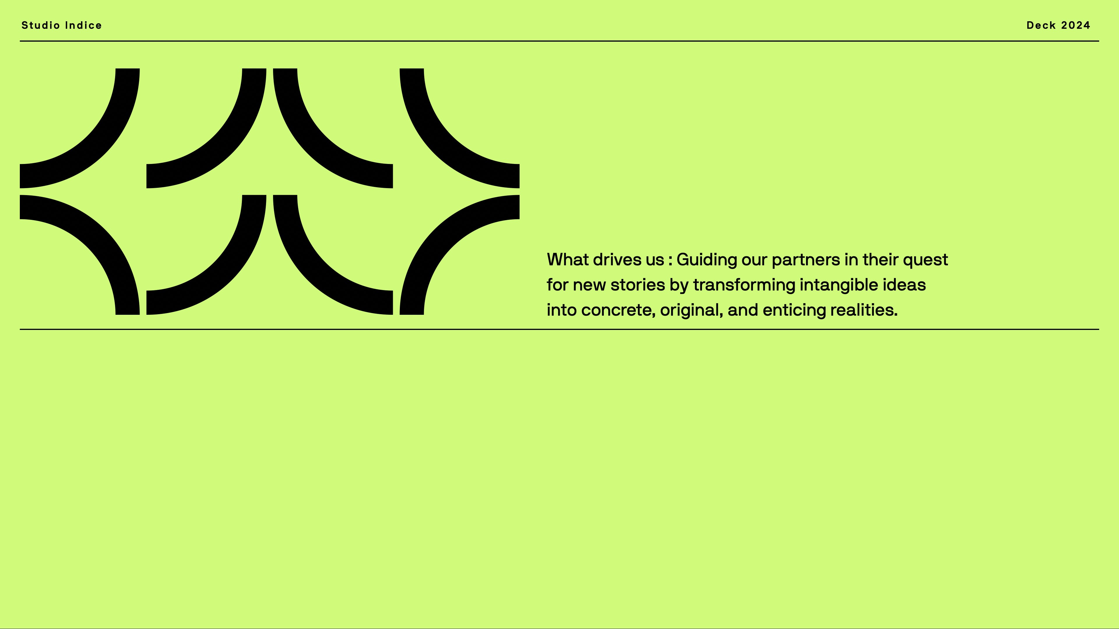
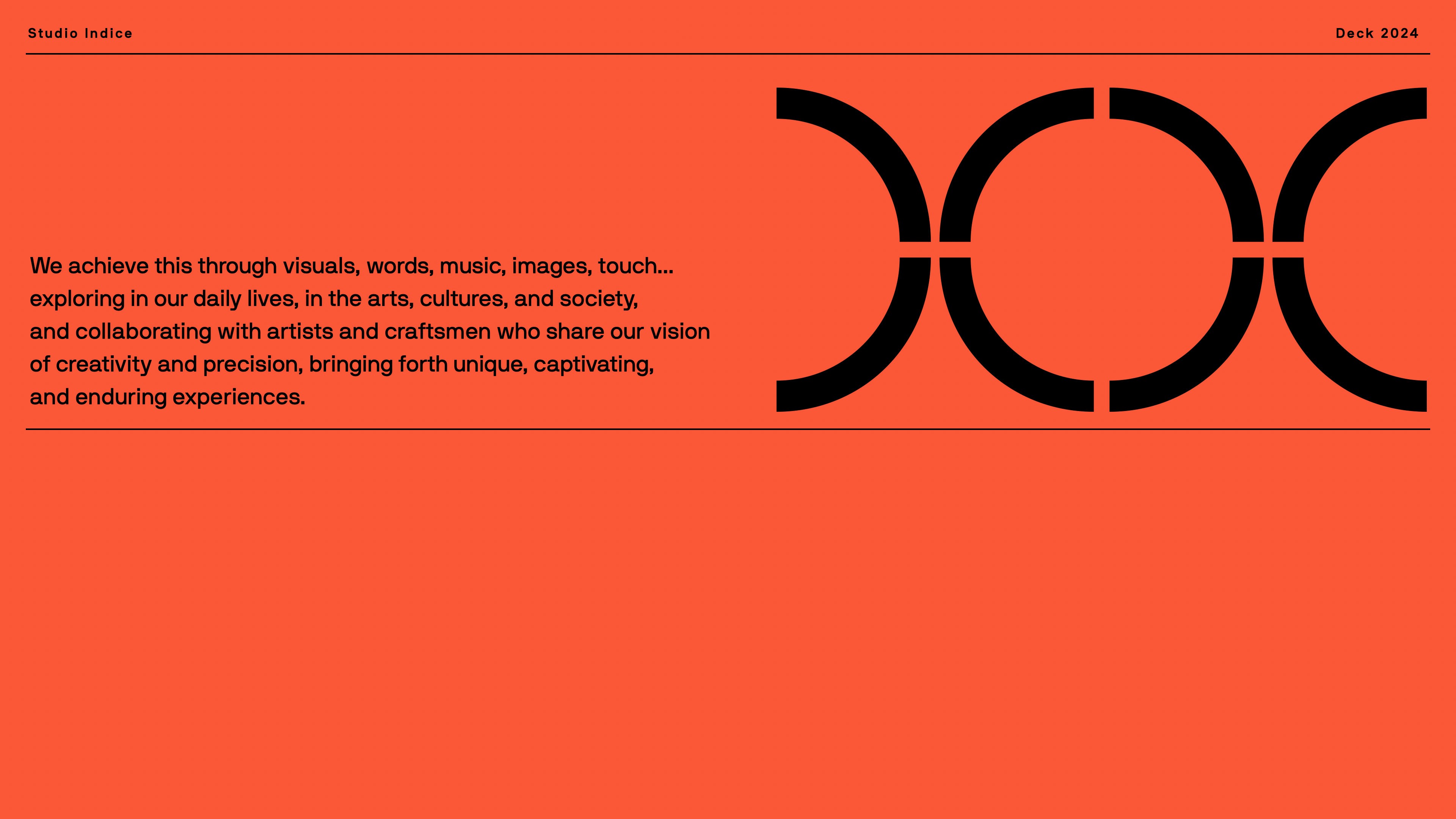
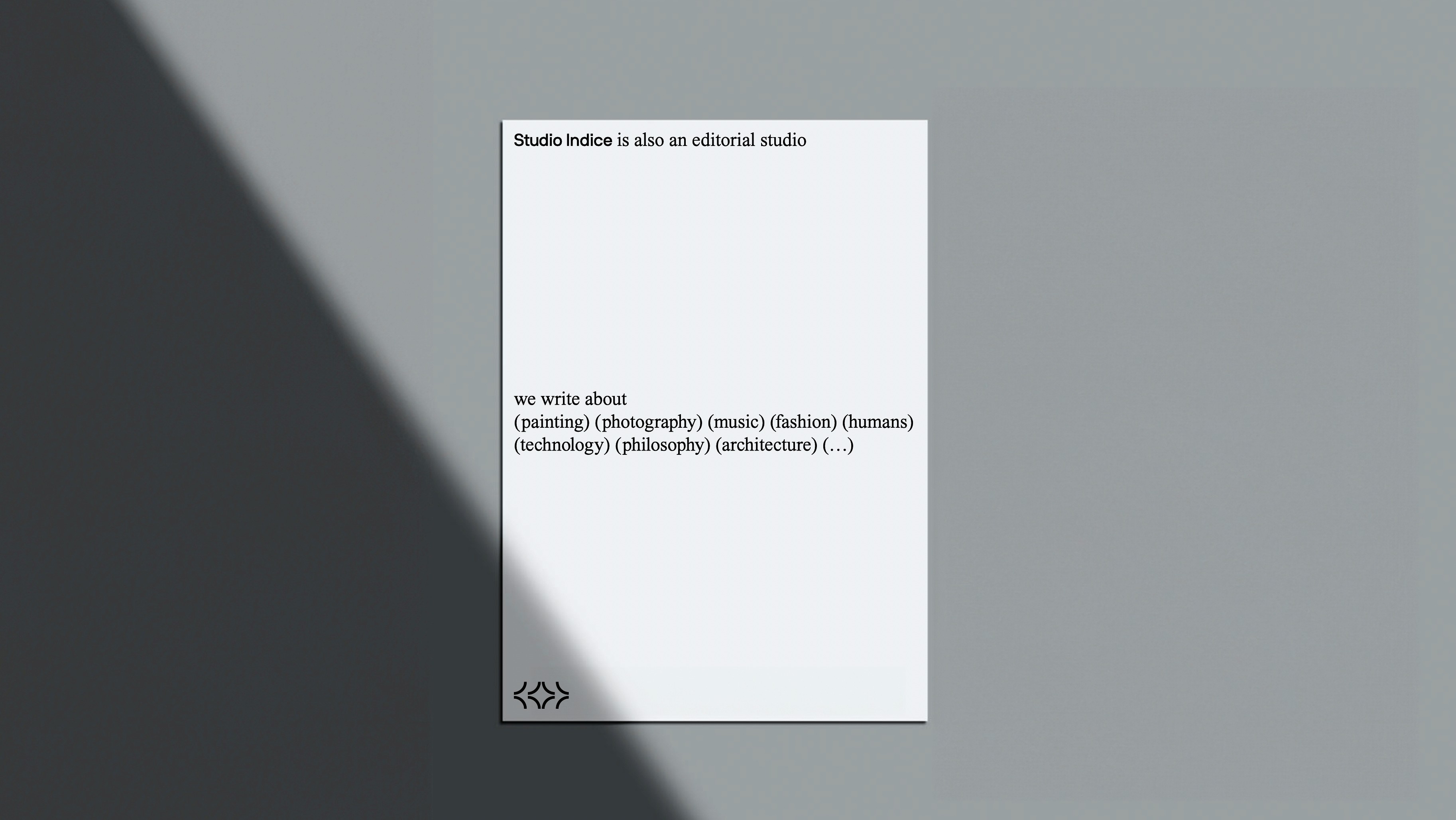
Because what we love to do is piece together elements to create meaningful identities, we've crafted for us a design that embodies our philosophy as a creative studio. Thus, our in-motion logo takes shape in various forms from elements that converge seamlessly. The chosen typography, NB International, is what we strive for in our projects: timeless, with meticulous attention to detail and a smooth transition from print to screen. As for colors, we've opted for black and white as our primary palette, but we've also added vibrant hues of green and red to express the boundless energy and liveliness infusing our work.
In short, Studio Indice is where every creation emanates unity, coherence, and endless creativity.
Services
Brand Identity
Naming
Photography
